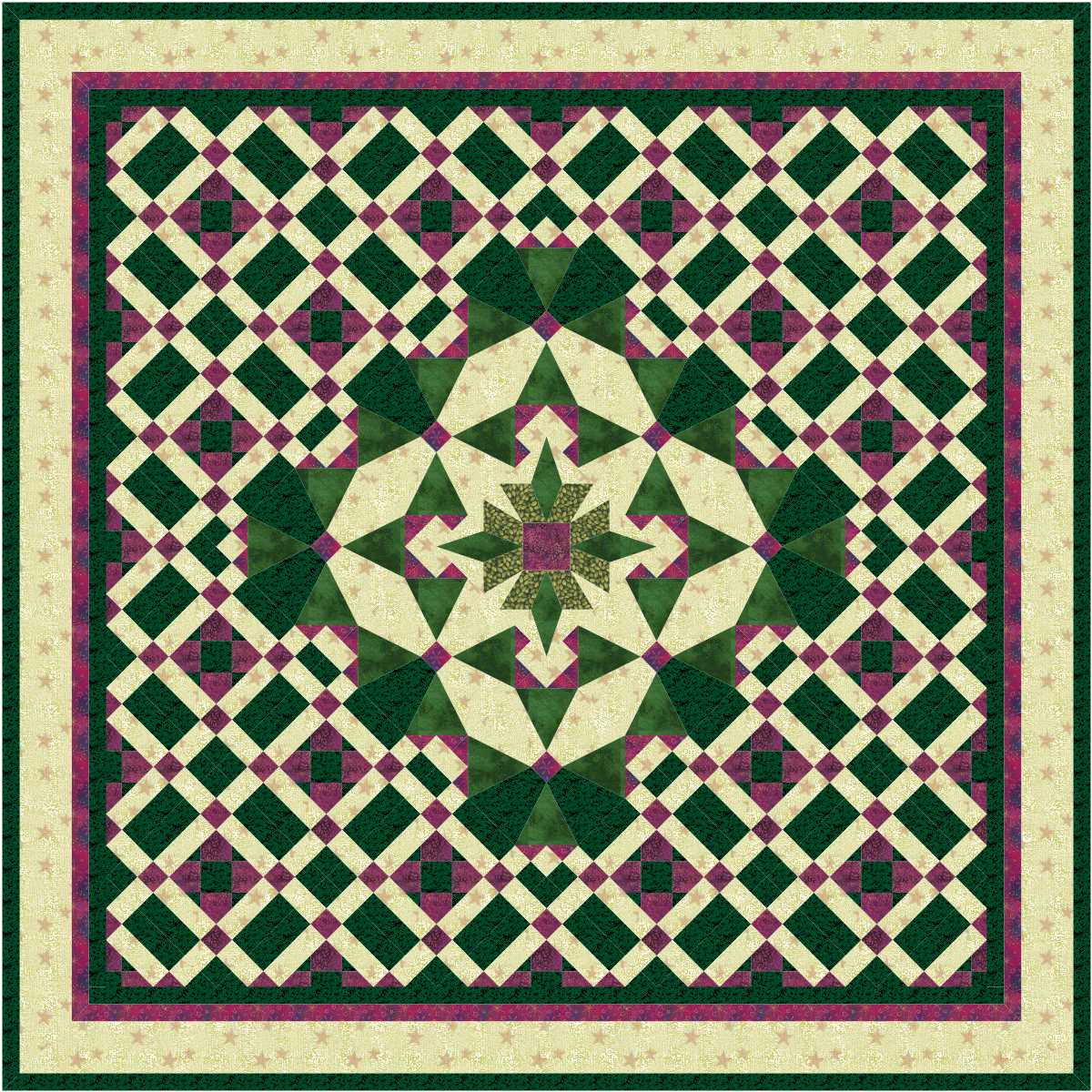
I love the centre of the first design for today.

Love all of the second design … the darker background makes the centre stand out much more.
read more
I love the centre of the first design for today.

Love all of the second design … the darker background makes the centre stand out much more.
read more
Love the centre, but I am not very impressed with the surroundings.

Wow! What a difference a few clicks can make! Love the result.
read more
Not sure about the colours in the first design, but love the design itself. Perhaps it is the applique which makes it a winner for me.

Love the centre block in this one … it works much better on point than it does in a straight setting.
read more
Very interesting!

Another interesting design.
I would usually say that the second, with the applique, was my favourite of the two, but both these designs are something a bit different to the average quilt designs I cannot pick a favourite.
read more